Two-variable data — line of best fit, correlation vs. causation
So far each data point has been a single number. Now each point pairs two numbers: hours studied and the score that went with them, for one student. Plot every such pair as a dot on the coordinate plane and you get a scatter plot, a cloud of dots, one per student.
Real data never lands on a neat line, but you can usually see a trend in the cloud, and you can draw the straight line that threads through it best. That line is the payoff of this lesson, because it's the same f(x) = mx + b from Unit 5, now earning its keep on messy, real data, where you use it to predict.
Picture that cloud and a line drawn through the middle of it. The line doesn't have to touch a single dot; it captures the overall direction the dots lean. While the picture is in front of you, you can read two different things off it by eye.
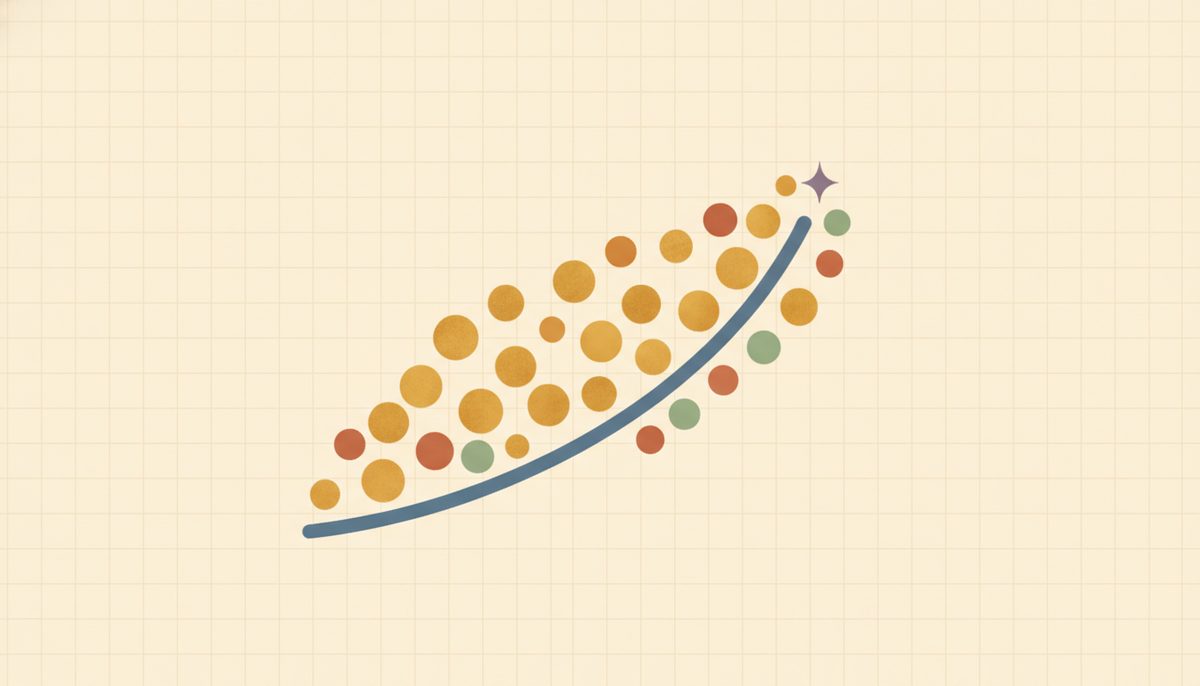
The first is the direction of the lean, which has a name: the association. If the dots rise from left to right, meaning more hours and higher scores, that's a positive association. If they fall from left to right, that's negative. If there's no clear up-or-down lean at all, there's no association. Here's a scatter of (hours studied, score) with a best-fit line running through it, climbing to the right A.2.f1; that upward lean is a positive association.
The second thing you can read is how tightly the dots hug that line: the strength of the correlation. A narrow band of dots pressed close to the line is a strong correlation; a loose, fat scatter around it is a weak one. Strength and direction are separate questions: a weak positive and a strong positive both lean up; they just differ in how tightly the dots cling. You read both of these by eye here. You don't compute a number for either.
There's one check to do before you trust any line, and it's the move people skip. Glance at the cloud and ask: is this roughly straight? A line of best fit only makes sense when the dots actually run along a line. If the cloud bends, curving like a U or an arch, or if it's a shapeless blob, then a straight line is the wrong model, and forcing one through would summarize and predict badly no matter how carefully you draw it.
This shape question has its own name, the form, and it's separate from direction. So the order is always: see the dots, check the form is linear, then fit or use a line. (While you're looking, scan for an outlier too. A single dot sitting far off the trend can tilt the whole line.)
Once you've confirmed a line is appropriate and you have f(x) = mx + b, predicting is nothing new. It's just evaluating the function from Unit 5.4: plug in an x, read off the predicted y. Same machine, pointed at data.
New words
- A.2.d1 Scatter plot: a coordinate-plane graph of paired data, where each data point is one (x, y) dot (e.g. hours studied vs. test score).
- A.2.d2 Association: the overall trend in the cloud of dots:
- Positive: as x goes up, y tends to go up (dots rise left-to-right).
- Negative: as x goes up, y tends to go down (dots fall).
- No association: no clear up-or-down trend.
- A.2.d3 Form: the shape of the cloud. Does it run roughly along a straight line (linear) or does it curve / bend (nonlinear)? Form is a separate question from direction, and it's the one that decides whether a line is even the right summary.
- A.2.d4 Line of best fit: a straight line f(x)=mx+b drawn to pass as close as possible to all the dots. It's the same linear function from Unit 5, now fit to data that doesn't sit perfectly on any line. Used to predict a y for a new x. (A line is only appropriate when the form is roughly linear, so check that first.)
- A.2.d5 Correlation: a measured tendency for two variables to move together. Read it qualitatively here: its direction (positive or negative, from which way the cloud leans) and its strength, which is strong if the dots hug the line tightly, weak if they're loosely scattered around it. Causation: one variable actually makes the other change. Correlation and causation are not the same.
Now the idea this whole unit is built around. Two things can move together for a reason that has nothing to do with one causing the other. In summer, ice cream sales and drowning incidents both climb. They're correlated: they really do rise together. But ice cream doesn't cause drownings.
A hidden third cause, hot weather, drives both: heat sends people out for ice cream and into the water. Statisticians have a name for that hidden third factor, a lurking (or confounding) variable, but the everyday idea is what matters. Two things moving together never, on its own, proves one causes the other. The question to ask every time is: could some third factor explain both? Could it just be coincidence?
The worked examples below put each of these moves into practice: predicting from a line, naming an association, catching a false cause, checking the form, and reading strength.
Worked example
-
A.2.w1 A line of best fit for some data is y = 2x + 3. Predict y when x = 5. This is just evaluating the function at x = 5, written out: $$y = 2(5) + 3 = 10 + 3 = 13.$$ So we'd predict about 13, and "about" is the honest word, because a best-fit prediction is an estimate, not a guarantee. (It's the same as finding f(5) for f(x) = 2x + 3, the move from Unit 5.4.)
-
A.2.w2 Describing the association. A scatter of (hours studied, test score) shows dots that climb left-to-right, since students who studied more generally scored higher, so that's a positive association. A scatter of (hours of TV, test score) whose dots drift downward would be a negative association. And a scatter of (shoe size, test score) with dots flung every which way, no lean at all, shows no association. The single question each time: as x increases, does y tend to go up, go down, or do neither?
- A.2.w3 Correlation versus causation. "Towns with more firefighters at a blaze tend to have more fire damage." Does sending more firefighters cause more damage? No. The lurking variable is the size of the fire. A bigger fire causes both more firefighters being called and more damage. The two move together, but neither one causes the other; the third factor drives both.
- A.2.w4 Checking the form before fitting a line. Compare two scatters. In the first, (hours studied, score) dots run in a roughly straight, rising band, so the form is linear and a line of best fit is a sensible summary; go ahead and fit it. In the second, (hours of practice, score) dots rise quickly and then level off, bending into an arch, so the form is nonlinear. A straight line is the wrong model here: it would overshoot the part that flattens out and predict badly. A shapeless blob is the same story; no line summarizes it. The move is always: look at the form first, and only fit a line when the cloud is roughly straight.
- A.2.w5 Reading a correlation by eye. Two scatters both lean upward, so both are positive. In the first, the dots sit in a tight, narrow band right along the trend; in the second, they're loosely scattered in a fat cloud around it. Both are positive, but the first shows a strong correlation and the second a weak one. Strength is simply how tightly the dots hug the line. You read this by eye; you don't compute a number for it at this level.
It's easy to read "two things are correlated" as "one causes the other"; the mind reaches for a cause automatically. But correlation only says they move together. Before you believe a cause, ask whether a third factor could be driving both (heat behind the ice cream and the drownings; fire size behind the firefighters and the damage), or whether it's coincidence. If a lurking variable fits, the correlation isn't evidence of cause.
One smaller point, too: real data doesn't sit on the line. The dots scatter around it, and the best-fit line is a summary of the crowd, not a promise about any one dot.
And a prediction from that line is most trustworthy near the data it came from. Reaching far past the data, like predicting a score for 20 hours of study when nobody studied more than 6, stretches the line into territory it never saw, so trust those far-out predictions less.
Visuals reminder for this lesson: if it helps, sketch the scatter and run a straight line through the middle of the cloud, then read its lean and how tightly the dots hug it.
Check yourself
- A.2.c1 A best-fit line is y = −(1/2)x + 10. Predict y at x = 4, and say whether the association is positive or negative. How can you tell from the equation? (y = −(1/2)(4) + 10 = −2 + 10 = 8. The association is negative, because the slope −1/2 is negative: as x rises, y falls.)
- A.2.c2 Sales of sunglasses and the number of people getting sunburned both rise in July. Are they correlated? Does one cause the other? What's really going on? (They're correlated, since they rise together, but neither causes the other. The lurking variable is sunny, hot weather, which drives both more sunglasses sales and more time outdoors getting burned.)
- A.2.c3 Two scatter plots: in one the dots rise steadily; in the other they're a shapeless blob. Describe each association. (The rising one is a positive association; the shapeless blob shows no association.)
- A.2.c4 Before you draw a line of best fit, what should you check about the shape of the scatter? Describe a cloud where a straight line would be the wrong summary, and say why. (Check the form. Is the cloud roughly straight? A cloud that curves, like an arch that rises then levels off, is the wrong fit for a line: the line would overshoot the flat part and predict badly.)
- A.2.c5 Two scatters both lean upward, but one is a tight narrow band and the other a loose fat cloud. Which shows the stronger correlation, and does "stronger" change whether it's positive or negative? (The tight narrow band shows the stronger correlation. "Stronger" is about how tightly the dots hug the line. It doesn't change the direction; both are still positive.)
You can now read a scatter plot, check its form before trusting a line, describe its association and strength by eye, predict from a best-fit line, and keep correlation and causation apart.
As before, the mix is the point. Every problem has its answer at the end of the lesson, and the worked example it's based on is right above if one stalls you.
Predict using the given line of best fit. The line in problems 1 and 2 was built from data that ran from x = 1 to x = 6:
Reveal answerHide to problem 1
2(5)+3 = 13. Inside the data range (x = 5 is within 1–6) — an interpolation.Reveal answerHide to problem 2
2(10)+3 = 23. Outside the range (x = 10 is past 6) — an extrapolation. Problem 1 is more trustworthy: a best-fit line predicts best near the data it came from; x = 10 reaches well beyond it.Reveal answerHide to problem 3
3(4)-1 = 11.Reveal answerHide to problem 4
-2(3)+10 = 4. Negative association — the slope is negative (-2), so as x rises, y falls.Reveal answerHide to problem 5
1/2(6)+1 = 4.Conceptual (describe / explain):